Code
import numpy as np
import matplotlib.pyplot as plt

def sigmoid(z):
    return 1 / (1 + np.exp(-z))

z = np.linspace(-10, 10, 100)

plt.plot(z, sigmoid(z))
plt.xlabel('z')
plt.ylabel('σ(z)')
plt.title('Sigmoid function')

plt.show()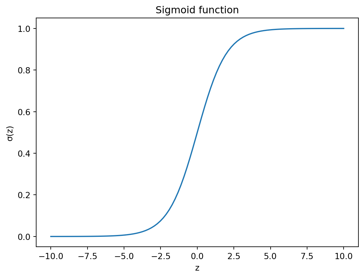
In the previous chapter we learned about linear regression. The word regression is used in the context of statistical modelling to refer to the act of estimating the relationship between a dependent variable and one or more independent variables. However, sometimes what we are trying to predict might not be a continuous numerical variable, but categorical. In such cases, instead of a regression problem, we are dealing with classification. In the simplest case, there are only two distinct classes. This is called binary classification. One of the simplests algorithms for solving these types of problems is called logistic regression, which despite its name, is used for classification.
In univariate logistic regression, we have a single independent variable and a binary dependent variable. The goal is to estimate the probability that the dependent variable is 1, based on the value of the independent variable. This implies that the values of the categorical dependent variable are assigned so-called dummy values, and are therefore coded as 0 and 1. For example, if we are trying to predict whether a student will pass or fail an exam based on the number of hours they studied, we can code the dependent variable as 1 if the student passed and 0 if they failed.
The logistic function is used to model the relationship between the inpedendent and dependent variables. The logistic function is defined as:
\[ y = \frac{1}{1 + e^{-(\beta_0 + \beta_1 x)}}, \tag{10.1}\]
where \(y\) is again the dependent variable, and \(x\) is the independent variable, and \(\beta_0\) and \(\beta_1\) are the parameters of the model. As you might have noticed, the exponential term contains the linear regression equation. This is not a coincidence. The logistic regression uses something called the sigmoid function, which basically transforms the output of the linear regression into a probability. The sigmoid function is defined as:
\[ \sigma(z) = \frac{1}{1 + e^{-z}}. \tag{10.2}\]
If we plot out the sigmoid function, we can see that it has a distinct shape, which somewhat resembles the letter S. Figure 10.1 shows the sigmoid function with \(z\) on the x-axis and \(\sigma(z)\) on the y-axis.
import numpy as np
import matplotlib.pyplot as plt
def sigmoid(z):
return 1 / (1 + np.exp(-z))
z = np.linspace(-10, 10, 100)
plt.plot(z, sigmoid(z))
plt.xlabel('z')
plt.ylabel('σ(z)')
plt.title('Sigmoid function')
plt.show()The beauty of the Sigmoid function is that it coerces any input to the variable \(z\) to lie between 0 and 1. This is exactly what we need for a probability. In other words, if the values we are trying to predict are binary, with values 0 and 1, the sigmoid function will essentially give us the probability that the value is 1.
Let’s see how we can fit a logistic regression model in practice. For this, we will explore the UCI ML Repository Breast cancer dataset, which contains information about breast cancer patients (Wolberg, William (1992)). Add one more citation… Table 10.1 shows the first few rows of the dataset. The Class column contains the dependents variable. Benign cases are labelled with 2, whereas malignant cases are labelled with 4.
import pandas as pd

bc_data = pd.read_csv('data/uci_bc_mod.csv')

bc_data.head()| Clump_thickness | Uniformity_of_cell_size | Uniformity_of_cell_shape | Marginal_adhesion | Single_epithelial_cell_size | Bare_nuclei | Bland_chromatin | Normal_nucleoli | Mitoses | Class | |
|---|---|---|---|---|---|---|---|---|---|---|
| 0 | 5 | 1 | 1 | 1 | 2 | 1.0 | 3 | 1 | 1 | 2 |
| 1 | 5 | 4 | 4 | 5 | 7 | 10.0 | 3 | 2 | 1 | 2 |
| 2 | 3 | 1 | 1 | 1 | 2 | 2.0 | 3 | 1 | 1 | 2 |
| 3 | 6 | 8 | 8 | 1 | 3 | 4.0 | 3 | 7 | 1 | 2 |
| 4 | 4 | 1 | 1 | 3 | 2 | 1.0 | 3 | 1 | 1 | 2 |
Let’s start by plotting the Uniformity_of_cell_size variable against the Class variable. We’ll recode the class variable so that benign cases are labelled as 0 and malignant cases as 1. Figure 10.2 shows the relationship between the two variables with a logistic model fit using Seaborn.
import seaborn as sns

# let's recode Class labels as 0 (=2) and 1 (=4)
bc_data['Class'] = bc_data['Class'].map({2: 0, 4: 1})

sns.lmplot(data=bc_data, x='Uniformity_of_cell_size',
y='Class', logistic=True, ci=95, height=4, aspect=1.5)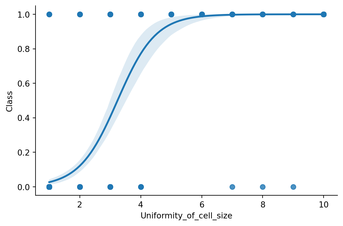
Just by looking at the scatter plot, it is not obvious to tell what the relationship between the two variables is. However, the logistic regression line helps us to see the relationship more clearly. Let’s plot the class distributions as histograms to clarify the relationship between the two variables (Figure 10.3).
sns.histplot(data=bc_data, x='Uniformity_of_cell_size', hue='Class',
bins=20, kde=True)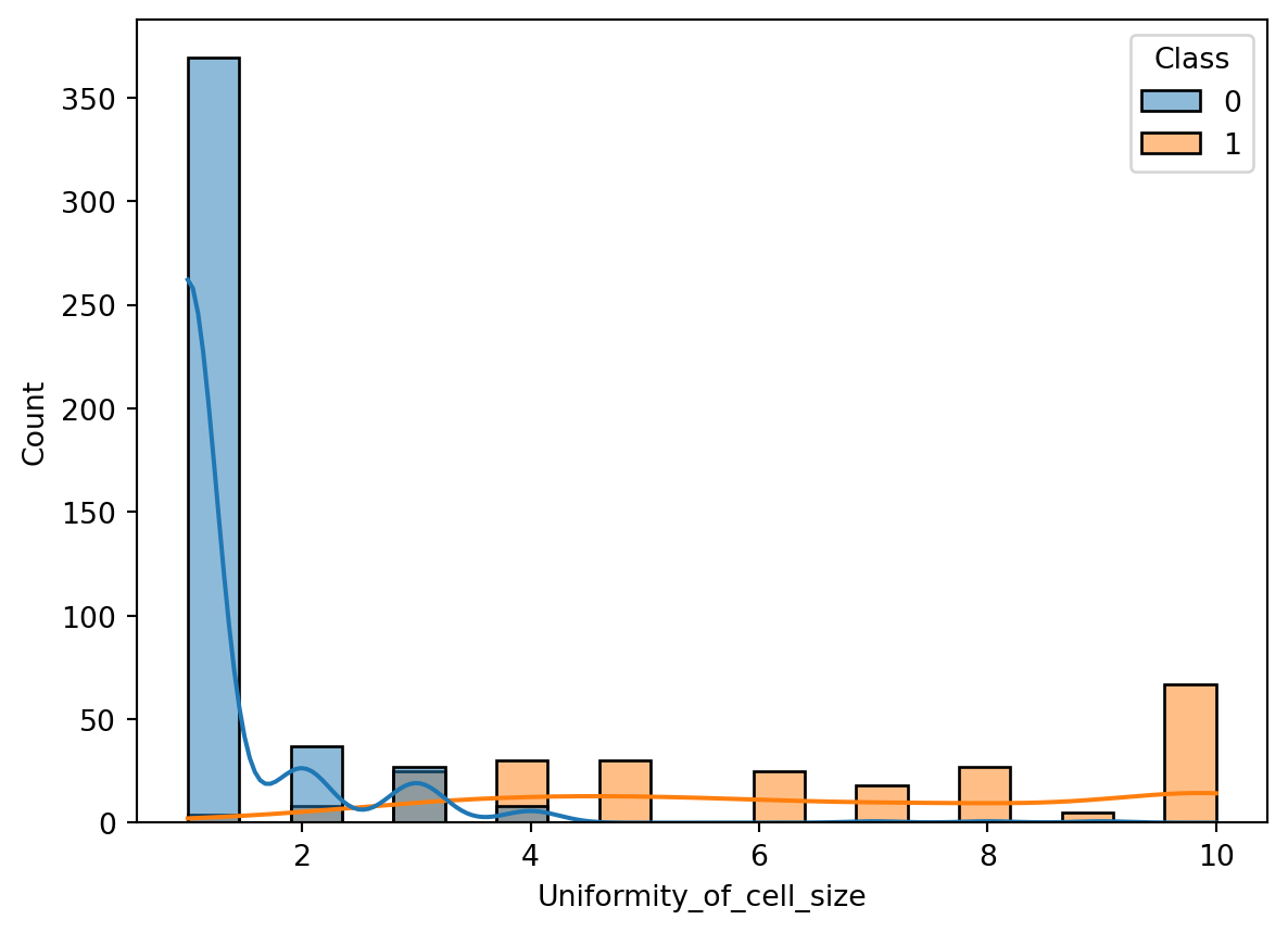
The histogram clarifies why the logistic regression line is shaped the way it is. Most benign cases appear to have smaller values for the uniformity of cell size.
Above we visualized the logistic relationship between the Uniformity_of_cell_size variable and the Class variable using seaborn. We are now ready to use scikit-learn to fit a logistic regression model to the data. Let’s start by splitting the data into training and testing sets.
from sklearn.model_selection import train_test_split

X = bc_data[['Uniformity_of_cell_size']]
y = bc_data['Class']

# train test split
X_train, X_test, y_train, y_test = train_test_split(X,
y, test_size=0.3, random_state=42, stratify=y)
We used the train_test_split function again to split the data into training and testing sets. The stratify parameter ensures that the distribution of the target variable is the same in both train and test sets. This is important if the target variable displays a class imbalance. In our case the target variable is not terribly unbalanced, but it is still good practice to learn to use the stratify parameter.
# class distribution for benign and malignant cases
bc_data['Class'].value_counts()
Class
0 444
1 239
Name: count, dtype: int64We can now use the LogisticRegression class from the linear_model module. The fit method is used to train the model. Summary of the model parameters is shown in Table 10.2.
# fitting the model
from sklearn.linear_model import LogisticRegression

log_reg = LogisticRegression()
log_reg.fit(X_train, y_train)LogisticRegression()In a Jupyter environment, please rerun this cell to show the HTML representation or trust the notebook.
LogisticRegression()
model_summary = pd.DataFrame(
    data=np.array([log_reg.intercept_, log_reg.coef_[0]]),
    index=['Intercept', 'Uniformity_of_cell_size'],
    columns=['Coefficient'])

model_summary| Coefficient | |
|---|---|
| Intercept | -5.414761 |
| Uniformity_of_cell_size | 1.679305 |
We have managed to fit a model to the training data, but thus far our only result is the model parameters, which are quite abstract. To get a better sense of how well we are doing, in terms of prediction accuracy, let’s make predictions on our test data. As you might recall from the previous chapter, we can use the predict method to make predictions.
# making predictions
y_pred = log_reg.predict(X_test)

y_pred[:5]
array([0, 0, 0, 0, 1], dtype=int64)By looking at the first five predictions, we can see that the model predicts the class of the test data. But how does it actually do that? By looking at the logistic regression curve in Figure 10.2, we see that the curve should predict a continuous floating point value between 0 and 1. Yet our predictions seem to be binary.
The predict method actually uses a threshold of 0.5 to decide whether the predicted value should be 0 or 1. If the predicted value is greater than 0.5, the prediction is 1, otherwise it is 0. This makes perfect sense when we think of the output values as probabilities.
Now that we have our predictions, we can compare them to the actual values in the test set. For linear regression we used a scatter plot as visual means for comparing the predictions to the actual values. Figure 10.4 shows the scatter plot of the actual values against the predicted values for the logistic regression model. However, upon inspection we notice that this approach doesn’t really work with classification problems.
plot = sns.scatterplot(x = y_test, y = y_pred)
plot.set_xlabel('Actual values')
plot.set_ylabel('Predicted values')

plot.figure.set_size_inches(5, 4)

plt.show()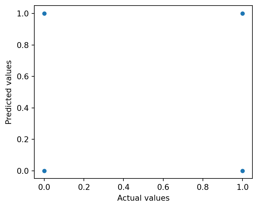
Luckily, there are other ways to visualize our results. Something called a confusion matrix will be more helpful here. Let’s visualize the confusion matrix for our case before digging in deeper (Figure 10.5).
from sklearn.metrics import confusion_matrix

cm = confusion_matrix(y_test, y_pred)

cm_plot = sns.heatmap(cm, annot=True, fmt='d', cmap='Blues', cbar=False)

cm_plot.set_xlabel('Predicted Malignancy Class')
cm_plot.set_ylabel('Actual Class')

plt.show()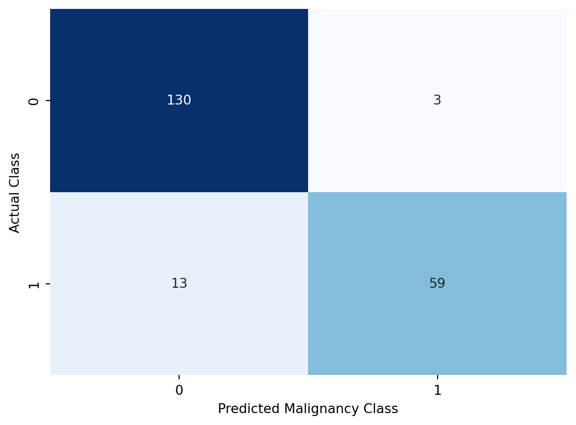
Let’s break down what is happening above. As we recall, we labelled benign cases as 0 and malignant cases as 1. In other words, our diagnosis would be positive for a person with cancer. Vice versa, a negative diagnosis would be a person without cancer. The confusion matrix shows us how well our predictions match the actual class labels. We have four possible outcomes:
Intuitively, we can see that we would like to see as many cases in the diagonal elements of the confusion matrix to maximize the “goodness” of our predictions. The four categorries above allow us to calculate a set of more formally defined metrics, which are generally used to evaluate the performance of classification models.
There’s a long list of different metrics which have been developed to evaluate the performance of binary classification models. Below we will introduce some of the most common ones, but take note that the list is not by any means exhaustive.
Probably the easiest metric to understand is accuracy. It is defined as the number of correct predictions divided by the total number of predictions. We can define it using the four categories above as follows:
\[ \text{Accuracy} = \frac{\text{TP} + \text{TN}}{\text{TP} + \text{TN} + \text{FP} + \text{FN}}. \tag{10.3}\]
In the case our univariate logistic regression fit, the accuracy of the model is calculated as:
(59 + 130) / (59 + 130 + 3 + 13)0.9219512195121952You might have already guessed it, but scikit-learn ships with a convenient function for calculating accuracy.
from sklearn.metrics import accuracy_score

accuracy_score(y_test, y_pred)0.9219512195121952Our simple logistic regression model is able to predict 92% of the cases in the test set correctly. This is pretty well, considering that we only used a single variable to make the predictions.
Let’s consider a rare disease, which only appears in 1 out of 100 000 people. By building a model that predicts all the negative cases correctry we would be able to achive a 99.999% accuracy, which sounds very impressive. However, this could be achived with a simple model, which always predicts a negative class label. Despite the impressive accuracy, this model would be 0% accurate in predicting the positive cases. Therefore, especially in presence of class imbalance, care should be taken when interpreting accuracy.
True positive rate, also known as sensitivity or recall, is defined by looking at the row of the confusion matrix that corresponds to the positive class. As the name implies, this tells us how sensitive our model is in regognizing the positive cases. Using the four classes define above, we get for True Positive Rate (TPR):
\[ \text{TPR} = \frac{\text{TP}}{\text{TP} + \text{FN}}. \tag{10.4}\]
For our example, we get:
59 / (59 + 13)0.8194444444444444With scikit-learn we can calculate the true positive rate as follows:
from sklearn.metrics import recall_score

recall_score(y_test, y_pred)0.8194444444444444True Negative Rate (TNR), also known as specificity, is has a similar definition to the True Positive Rate, but it looks at the negative class. The formula for True Negative Rate is:
\[ \text{TNR} = \frac{\text{TN}}{\text{TN} + \text{FP}}. \tag{10.5}\]
This translates to:
130 / (130 + 3)0.9774436090225563With scikit-learn, we are forced to rely on a kind of a workaround for calculating specificity. There isn’t a function named after it, but as we mentioned above the definition is basically identical to recall (sensitivity). The only difference is that we are focusing on the negative class label. Therefore, we can use the recall_score function, but we need to specify the positive class label as 0.
from sklearn.metrics import recall_score

recall_score(y_test, y_pred, pos_label=0)0.9774436090225563It seems that our model is better at identifying the negative cases than the positive ones.
The previous two metrics were defined based on the rows of the confusion matrix. Positive predictive value, also known as precision, is defined by looking at the column with the positive predictions. We defined it as:
\[ \text{PPV} = \frac{\text{TP}}{\text{TP} + \text{FP}}. \tag{10.6}\]
So in essence we are looking to see which proportion of our positive predictions are correct. Let’s see the precision of our logistic regression fit the manual way, and then with scikit-learn.
59 / (59 + 3)0.9516129032258065# with scikit-learn
from sklearn.metrics import precision_score
precision_score(y_test, y_pred)0.9516129032258065When our model does label something as positive, it is correct 95% of the time.
Negative predictive value is the counterpart of positive predictive value. It uses the column for the negative predictions in the confusion matrix. The formula for Negative Predictive Value (NPV) is:
\[ \text{NPV} = \frac{\text{TN}}{\text{TN} + \text{FN}}. \tag{10.7}\]
NPV tells us which proportion of our negative predictions was correct, which for our example is:
130 / (130 + 13)0.9090909090909091When we use scikit-learn, we need to apply the same trick we used for specificity, and that is to define the positive class label as 0.
from sklearn.metrics import precision_score

precision_score(y_test, y_pred, pos_label=0)0.9090909090909091So, when our model does label something as negative, it is correct 91% of the time (with the test data).
There is actually a convenient function in scikit-learn that calculates all the metrics we went through in one go. It’s called classification_report. Let’s see how it works.
from sklearn.metrics import classification_report

print(classification_report(y_test, y_pred))
precision recall f1-score support
0 0.91 0.98 0.94 133
1 0.95 0.82 0.88 72
accuracy 0.92 205
macro avg 0.93 0.90 0.91 205
weighted avg 0.92 0.92 0.92 205
The output is divided to columns, out of which the first two are labelled as precision and recall. On the left-hand side we see the class labels depicted by their numeric values (0 and 1). If we look at the results for the positive class (1), we see that the value for precision is 0.95 and for recall 0.82, which match the results we calculated manually. The row above shows the results for the negative class (0), and we can again confirm that the values correspond to the results we got for specificity and the negative predictive value (NPV). Additionally, the classification report provides a value for accuracy, as well as averages for the metrics across the classes.
The final metric that the classification report gives us is something called the F1-score. The F1-score is calculated from precision and recall by taking the harmonic mean of the two:
\[ F_{1} = \frac{2}{\text{precision}^{-1} + \text{recall}^{-1}}. \tag{10.8}\]
We can calculate the F1-score manually by substituting the values for precision and recall:
f1_res = 2 / (1/0.95 + 1/0.82)

f1_res.__round__(2)0.88Earlier we defined precision and recall by using the four categories of the confusion matrix. By substituting the formulas for precision (Equation 10.6) and recall (Equation 10.4) into Equation 10.8 we can define the F1-score as:
\[ F_{1} = \frac{2 \text{TP}}{2 \text{TP} + \text{FP} + \text{FN}}. \tag{10.9}\]
As you might have guessed, scikit-learn has a function for calculating the F1-score as well. It works exactly the same way as the other functions we have used for calculating metrics.
from sklearn.metrics import f1_score

f1_score(y_test, y_pred)0.8805970149253732In Section 10.1 and Section 10.2 we looked at univariate logistic regression, where a single independent variable was used to predict the dependent variable. This yielded pretty decent results, and was also easy to interpret. However, we still have a many variables in the dataset that we haven’t used yet. Let’s see how much our model improves when we feed it more variables.
Our data contains 9 different variables, and we will use all of them to predict the class variable. We will use the same train-test split as before, and then fit the model to the training data. The column in our data are:
bc_data.columnsIndex(['Clump_thickness', 'Uniformity_of_cell_size',
'Uniformity_of_cell_shape', 'Marginal_adhesion',
'Single_epithelial_cell_size', 'Bare_nuclei', 'Bland_chromatin',
'Normal_nucleoli', 'Mitoses', 'Class'],
dtype='object')We will need to reassing the X variable to include all the columns (excluding Class), and then split the data into training and testing sets.
X = bc_data.drop('Class', axis=1)

X_train, X_test, y_train, y_test = train_test_split(X,
y, test_size=0.3, random_state=42, stratify=y)
We can now fit the model to the training data.
log_reg_multi = LogisticRegression()
log_reg_multi.fit(X_train, y_train)LogisticRegression()In a Jupyter environment, please rerun this cell to show the HTML representation or trust the notebook.
LogisticRegression()
The classification report gives us a good overview of how well our model performs.
y_pred_multi = log_reg_multi.predict(X_test)

print(classification_report(y_test, y_pred_multi))
precision recall f1-score support
0 0.97 0.96 0.97 133
1 0.93 0.94 0.94 72
accuracy 0.96 205
macro avg 0.95 0.95 0.95 205
weighted avg 0.96 0.96 0.96 205
Adding more predictors has clearly improved the model performance. We can also see this when we take a look at the confusion matrix which is shown in Figure 10.6.
cm2 = confusion_matrix(y_test, y_pred_multi)

cm_plot_multi = sns.heatmap(cm2, annot=True, fmt='d', cmap='Blues', cbar=False)

cm_plot_multi.set_xlabel('Predicted Malignancy Class')
cm_plot_multi.set_ylabel('Actual Class')

plt.show()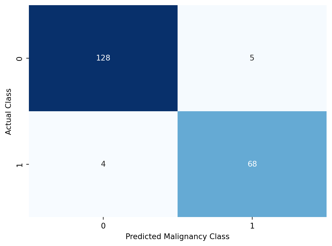
We can see that our logistic regression model does really well in predicting the malignancy class. And it does so with the test data, which it hasn’t seen before. This means that we have been able to avoid overfitting, which is crucial if we want our model to generalize well to new data.
In this chapter we learned about using logistic regression for binary classification problems. We saw how straightforward it is to fit a model using one or more variables as features. We also learned about different metrics that can be used to evaluate the performance of classification models, and how to interpret the results of these metrics. These metrics are useful for evaluation other classification models as well, not just logistic regression.